Each product you send keeps the supplier's tabs and its required components. Your theme shows them on the product page once Components and tabs is turned on.
It is one switch, turned on once for all your products. It is a Shopify app embed: the app never edits your theme's code, and you can turn it off at any time.
Turn on Components and tabs
You do this once, ideally before your first import.
- In the app, a blue box Show tabs and components on your product pages shows at the top of the New import page until the switch is on. It is also the first section of Settings, and it shows on the page of each import.
- Click Turn on components and tabs. Your theme editor opens on App embeds, with Components and tabs turned on.
- Click Save, at the top right of the theme editor.
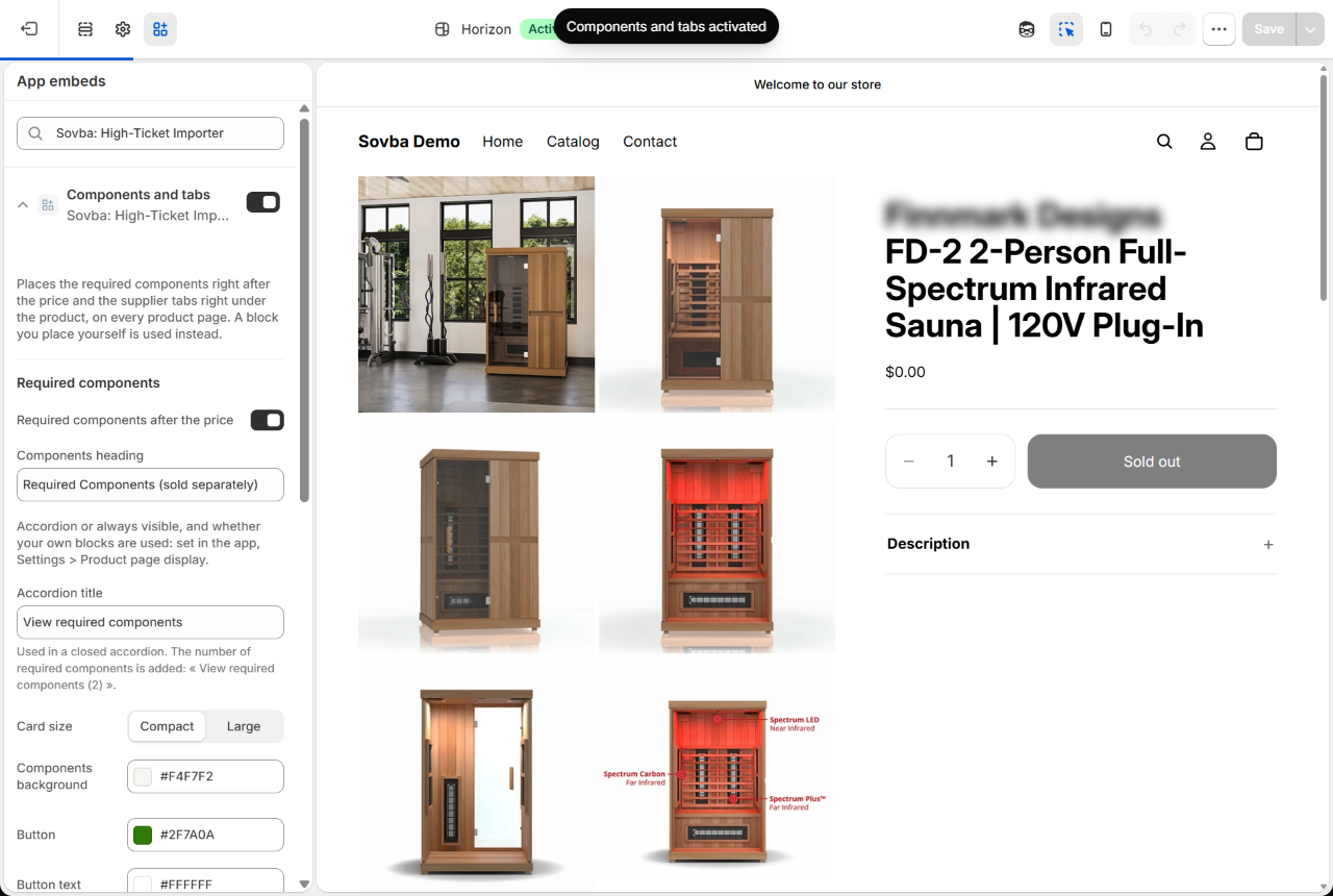
Back in the app, the box turns green: Components and tabs are on. There is nothing more to do. The blue box leaves the New import page; the green one stays in Settings.

What shoppers see
Required components, right after the price. These are the parts the product needs to work, such as heater stones or a control unit. Each one shows as a card with its photo, its name, your store's price and a + Add to cart button. A card appears once that component is active in your store.
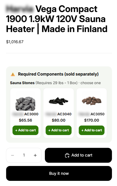
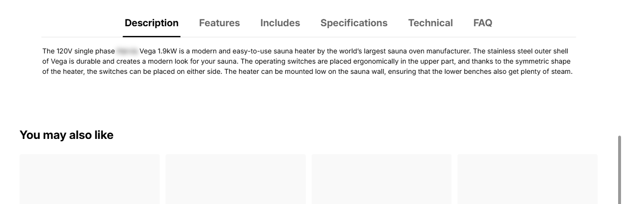
The supplier tabs, right under the product, before recommendations such as You may also like. On a phone, the tabs show as accordions that open one by one.
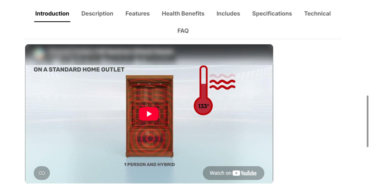
Videos. When the supplier shows videos in a tab, such as Introduction, the tab shows them as players. The videos load only when a shopper opens the tab, so your page stays fast.
An FAQ tab, with the questions buyers ask first, answered with the supplier's facts. You can turn it off in Settings.
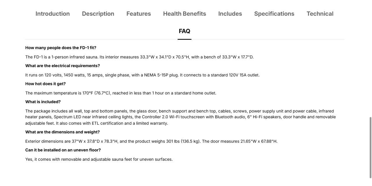
Documents (manuals, specification sheets) show as cards: the document title on the card, and the file name once it is opened.
Your product description shows in a closed Description accordion, so the required components stay right under the price.
Choose how they show
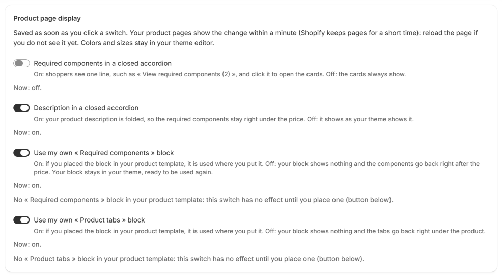
Open Settings in the app menu, then go to Product page display. Each switch is saved as soon as you click it. Your product pages show the change within a minute: reload the page if you do not see it yet.
| Switch | On | Off |
|---|---|---|
| Required components in a closed accordion | Shoppers see one line, such as View required components (2), and click it to open the cards. The number tells them there is something to buy with the product | The cards always show |
| Description in a closed accordion | Your product description is folded, so the required components stay right under the price | It shows as your theme shows it |
| Use my own « Required components » block | A block you placed in your product template is used where you put it | Your block shows nothing, and the components go back right after the price |
| Use my own « Product tabs » block | A block you placed is used where you put it | Your block shows nothing, and the tabs go back right under the product |
Under each Use my own switch, the app says how many of these blocks are placed in your product template.
Change colors and sizes
Colors, sizes and headings stay in your theme editor. In the app, click the button Change colors and sizes: it is in the green box, and in Settings. You can also go to your theme editor, then App embeds, then Components and tabs. Change what you want, then click Save.
| Setting | What it does |
|---|---|
| Required components after the price | Shows or hides the component cards |
| Components heading | The title above the cards. Default: Required Components (sold separately) |
| Accordion title (components) | The title of the closed accordion, when you turned it on in the app. The number of required components is added: View required components (2) |
| Card size | Compact fits next to the product photos. Large gives bigger cards |
| Components background, Button, Button text | The colors of the cards and of the Add to cart buttons |
| Accordion title (description) | The title of the description accordion. Default: Description |
| Supplier tabs under the product | Shows or hides the tabs |
| Tab title color, Selected tab color | Leave them empty to use your theme's text color |
| Tab title size, Tabs alignment, Tabs maximum width | The size and layout of the tabs |
Place them yourself
Components and tabs go to the usual places on every product page. Components and tabs cannot be moved in App embeds: to choose another place, you add a block to your product template.
Watch it in under a minute: Place the supplier tabs and required components yourself (video).
- In the app, open Settings, then go to Place components and tabs on your product page. The button Choose where they show, in the blue or green box, takes you there too.
- Two cards show: Supplier tabs and Required components. Click Place the tabs myself or Place the components myself. Your theme editor opens on your product template, with the block already added.
- Drag the block where you want it.
- Click Save, at the top right of the theme editor.
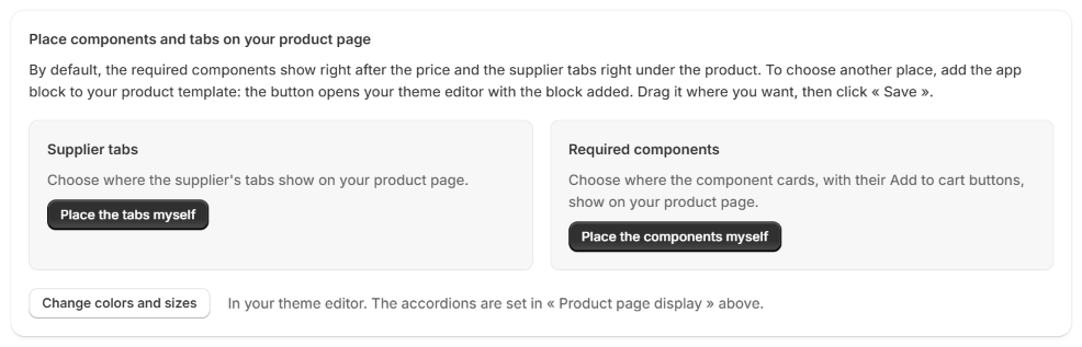
A block you place yourself is used instead of the automatic placement, as long as its Use my own switch is on in Product page display.
Once a block is placed, its card shows a green Placed badge instead of the button, with a link Open your theme editor to move it. One block of each is enough: if two are placed, the card says so. If you remove the block, the button comes back the next time you open Settings.
Your block has its own colors and sizes. Click it in your product template, in the theme editor, to change them. The accordions are still set in the app, in Product page display.
Go back to the automatic placement
In the app, open Settings, then turn off Use my own « Required components » block or Use my own « Product tabs » block. The components or the tabs go back to their usual places at once. Your block stays in your theme, showing nothing, ready to be used again if you turn the switch back on.
Go back to the default settings
Shopify has no reset button for an app's settings. To go back to the settings the app comes with, set these values again.
In the app, Settings, Product page display:
| Switch | Default |
|---|---|
| Required components in a closed accordion | Off |
| Description in a closed accordion | On |
| Use my own « Required components » block | On |
| Use my own « Product tabs » block | On |
In your theme editor, App embeds, Components and tabs, then click Save:
| Setting | Default |
|---|---|
| Required components after the price | On |
| Components heading | Required Components (sold separately) |
| Accordion title (components) | View required components |
| Card size | Compact |
| Components background | #F4F7F2 |
| Button | #2F7A0A |
| Button text | #FFFFFF |
| Accordion title (description) | Description |
| Supplier tabs under the product | On |
| Tab title color, Selected tab color | Empty (your theme's text color) |
| Tab title size | 20 px |
| Tabs alignment | Centered |
| Tabs maximum width | 1100 px |
A block you place yourself starts with these same defaults.
Good to know
- Not in the right place on your product page? Every theme is built differently. The app places the components and the tabs where most themes expect them, and never leaves them hidden: if your theme hides that place, they show right before the buy button instead. If you prefer another place, place them yourself (see above).
- The text of the tabs is edited in the app, in Tabs on each import, not in the theme editor. See the guide Edit the supplier tabs.
- If you turn Components and tabs off, the components and tabs disappear from your product pages. Their content stays saved on your products, and they come back when you turn it on again.
- To check a product as a shopper sees it, open your store in a private window.